Better.com logo
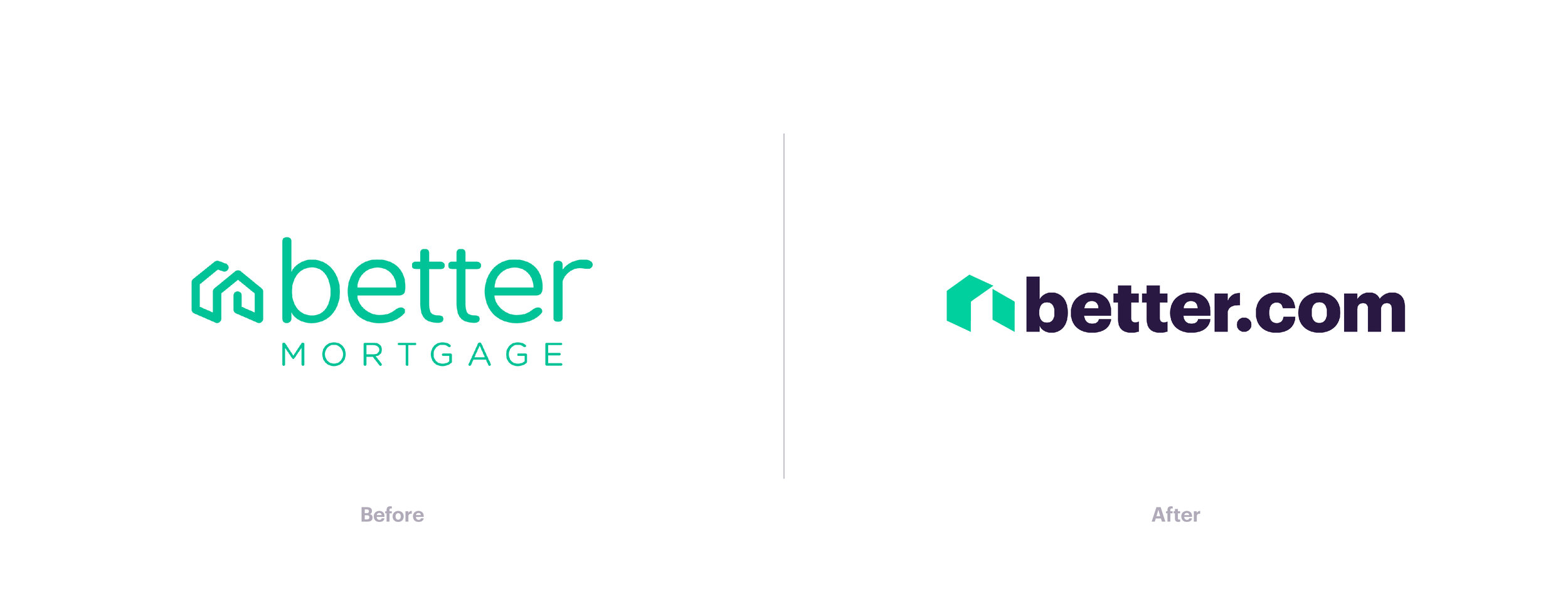
Better.com, once Better Mortgage when I started, needed their logo to evolve with the company. We knew the logo type would be Graphik, so I knew the icon was what needed the most love.
We explored many styles and different semiotics of what could communicate home. I realized early on that this redesign should be more of an evolution than a complete overhaul.
I took what we had and filled in the gaps. Creating an icon that better reflects our boldness and the force we aim to achieve as a company disrupting the mortgage industry.
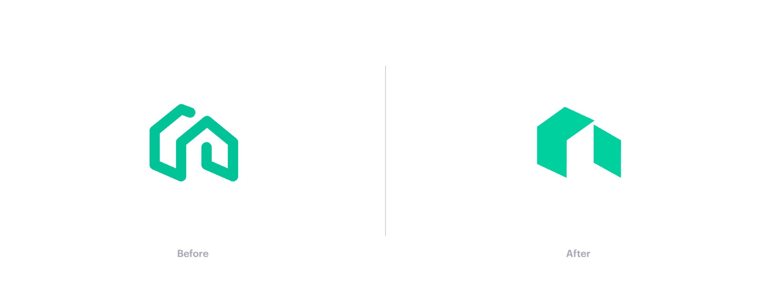
I remember sitting at my desk trying to figure out how the previous logo existed in the real world. I then took some post-it notes and began to cut and fold the paper to make a physical representation of the structure of the icon. I took photos of the result, turned that into vectors, and refined the two shapes to feel complete while in reality disconnected.